26 de junio de 2023

EL AMANTE DE LAS CORNISAS

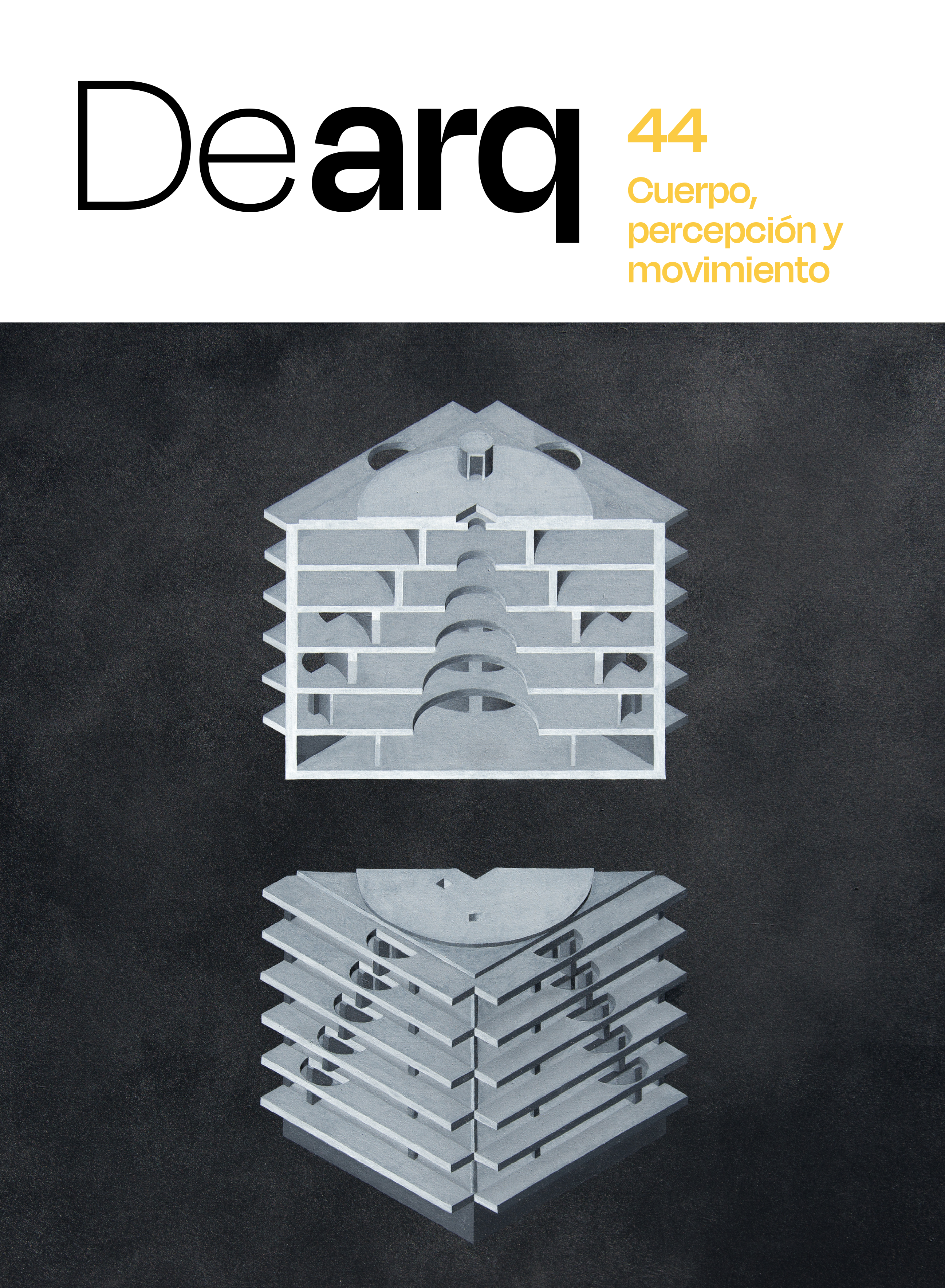
Pocos arquitectos modernos han estado tan enamorados de las cornisas como Paolo Portoghesi. Tan amantísimo era de este elemento aparentemente menor que no solo dedicó estudios completos a ellas, sino que se saltó una de las premisas de la modernidad: precisamente, el suprimirlas. La cornisa era el signo burgués por excelencia de la arquitectura a superar. La cornisa era el apéndice necesario del tejadito a dos aguas y tratar con ellas era declararse, como poco, posmoderno. Portoghesi se dedicó a pasear por Roma y documentar las hermosísimas cornisas de la arquitectura barroca y renacentista como si no hubiera un mañana. Y desde ahí a proyectar su arquitectura. Su amor por las cornisas, y por el pasado, le obligó a emplear sin fin las líneas de puntos para darles cuerpo. Aunque sea reduccionista, si piensa de este modo puede entenderse la práctica totalidad de su obra.
Su casa Baldi es un ejemplo inmejorable de la doble dimensión intelectual y de su finura como arquitecto. En un momento en que la modernidad no sabía ya cómo tratar con el pasado, la aportación de Portoghesi a la historia de la disciplina es lateral, si se quiere amanerada, pero explícita. Manteniendo las distancias, Zevi y Portoghesi en esto estuvieron conectados.
Los techos, las cornisas, fueron sus territorios preferidos. Creo que no precisamente por sus cualidades plásticas o constructivas, sino más bien porque eso significaba dirigir la mirada hacia lo alto. Metafóricamente al menos, eso sí que es un programa para ser arquitecto.      
Few modern architects have been as infatuated with cornices as Paolo Portoghesi. So enamoured was he with this minor element that he not only dedicated complete studies to them but also disregarded one of the premises of modernity: precisely the elimination of cornices. The cornice was the quintessential bourgeois sign of architecture to be overcome. The cornice was the necessary appendage to the gabled roof, and dealing with them meant, at the very least, declaring oneself postmodern. Portoghesi dedicated himself to strolling through Rome and documenting the exquisitely beautiful cornices of Baroque and Renaissance architecture as if there were no tomorrow. And from there, he projected his architecture. His love for cornices, and for the past, compelled him to endlessly employ dashed lines to give them substance. While it may be reductionist, thinking in this way can help us understand the vast majority of his work.
His Baldi House is an unparalleled example of the dual intellectual dimension and finesse as an architect. At a time when modernity no longer knew how to deal with the past, Portoghesi's contribution to the discipline's history is tangential, if somewhat affected, but explicit. Keeping their distance, Zevi and Portoghesi were connected in this regard.
Ceilings, cornices, were his preferred territories. I believe not necessarily because of their aesthetic or constructive qualities, but rather because that meant directing one's gaze upwards. Metaphorically at least, that's what it's like to be an architect.

19 de junio de 2023

DIFERENCIA Y REPETICIÓN Y REPETICIÓN Y REPETICIÓN

La sala hipóstila es un invento tan importante, primitivo e inmejorable como la bicicleta o el pan. En esencia, la repetición de un espacio idéntico se vuelve un juego de espejos, destruye todo sentido de orientación y nos coloca ante un "aquí" que es igual que el "allí". Por eso, toda sala hipóstila, sobre todo cuando concita ese abismo, juguetea con la esencia misma del yo y su vocación de situación.
Recurriendo a la etimología, la sala hipóstila, del griego "hypóstȳlos", no es ni más ni menos que el espacio "bajo columnas". Ese lugar isótropo, por definición, es el de la mezquita, el del depósito de agua, el del bosque y el de miles de aparcamientos subterráneos. El espacio modular que se extiende más allá de sí mismo ha servido para justificar, pues, desde espacios excelsos de la arquitectura de todos los tiempos a otros sin ningún valor. La religión y la industria emplean la sala hipóstila ancestralmente en virtud de su poder ideológico y espacial. La economía y lo trascendente nunca estuvieron tan próximos como en un campo de columnas. Ejemplos de lo primero los encontramos en las actuales fábricas, supermercados y grandes oficinas. De lo segundo en cientos de templos egipcios.
La proximidad de la sala hipóstila al espacio más moderno del Mat Building, inventado por Alison Smithson, no es casual. De hecho, el espacio de la sala hipóstila es su ancestro, una paleoforma de su origen y su destino. La sala columnada es el resultado directo de multiplicar esas columnas sin fin. La repetición de la sala hipóstila ha dado pie a ejemplos gloriosos también en la arquitectura peninsular: La iglesia de Almendrales, hermosísima obra de García de Paredes, y el pabellón de hexágonos de Corrales y Molezún son ejemplos excelsos.
Aparentemente, el problema de diseño de la sala hipóstila es el de la simple elección del módulo a repetir. Pero la cosa no es solo esa. Está el problema de saber de verdad cuál es el módulo constructivo, es decir, si se trata de un paraguas o de un problema de columnas y dintel. Más tarde está el asunto de los límites de la sala... En fin, todos problemas de oficio. Aunque aún hay otro mayor: ¿y si lo esencial de la sala hipóstila no fuese tanto la repetición de las columnas, sino la misma repetición? Y este no puede resolverse ya tan solo con oficio.  


The hypostyle hall is an invention as significant, primitive, and unmatched as the bicycle or bread. Essentially, the repetition of an identical space becomes a game of mirrors, destroying any sense of orientation and placing us before a "here" that is the same as "there." That is why every hypostyle hall, especially when it evokes that abyss, toys with the very essence of the self and its vocation for situation.
Referring to etymology, the hypostyle hall, from the Greek "hypóstȳlos," is nothing more or less than a "space under columns." That isotropic place, by definition, is found in the mosque, the water reservoir, the forest, and thousands of underground parking lots. The modular space that extends beyond itself has served to justify, therefore, spaces of great architectural value throughout history as well as those with no value at all. Religion and industry have ancestrally employed the hypostyle hall by virtue of its ideological and spatial power. Economy and transcendence were never so close as in a field of columns. Examples of the former can be found in current factories, supermarkets, and large offices, while the latter can be seen in hundreds of Egyptian temples.
The proximity of the hypostyle hall to the most modern space of the Mat Building, invented by Alison Smithson, is not coincidental. In fact, the space of the hypostyle hall is its ancestor, a paleoform of its origin and destiny. The columned hall is the direct result of multiplying those endless columns. The repetition of the hypostyle hall has also given rise to glorious examples in Peninsular architecture: the church of Almendrales, a beautiful work by García de Paredes, and the hexagonal pavilion by Corrales and Molezún are exceptional examples.
Apparently, the design problem of the hypostyle hall is simply choosing the module to repeat. But it's not just that. There is the issue of truly knowing what the constructive module is, whether it is an umbrella or a problem of columns and lintel. Later, there is the matter of the limits of the hall... Well, all these are professional problems. However, there is an even greater one: what if the essential aspect of the hypostyle hall is not so much the repetition of columns but repetition itself? And this cannot be resolved through mere craftsmanship.

12 de junio de 2023

ARQUITECTURA Y POSVERDAD

La cultura de la cancelación invade occidente como un cáncer. Este brazo armado de la corrección política, que hace que no pueda hablarse de casi nada por miedo a ofender, no puede ocupar, afortunadamente, amplias parcelas de la existencia. Por ejemplo y respecto a lo que aquí nos atañe, no existe una arquitectura capaz de ser cancelada. El coliseo romano no conserva ni rastro de los brutales asesinatos cometidos en su interior. En la casa del Fascio, maravillosa obra de Giuseppe Terragni, no quedan huellas reseñables del fascismo que le da nombre. Por mucho que se editen estudios sobre la inmensa contaminación producida por la construcción de la Torre Seagram, de Mies van der Rohe, el impacto de lo políticamente correcto no ha llegado retrospectivamente tan lejos como para afectar un ápice su carácter de obra maestra. Acaso a la arquitectura le está vedada dar cuerpo a la injusticia, ni a su reparación.
Si bien hoy hasta la propia Biblia está siendo cancelada como lugar donde se describen atrocidades, latrocinios, incestos y cosas no menores - ni Dios se libra de la estupidez humana -  la arquitectura permanece ante el mundo de la posverdad con una mudez insultante. Cuando la pintura de bodegones con chuletas y cadáveres de conejos se retira hoy ante la vista de comedores universitarios por resultar ofensiva para los veganos, ¿quién se siente interpelado por las obras erigidas en tiempos injustos por tiranos crueles y construidas sobre cadáveres?
Abandonadas en algún rincón las pancartas que antaño colgaban de sus fachadas con el rostro del dictador de turno, la arquitectura parece exenta de toda posible revisión desde el enfoque exclusivista de lo políticamente correcto. No derribamos las pirámides por mucho que sean un suculento terreno para el debate sobre la esclavitud o la explotación laboral. Al menos, porque su demolición ofendería a los ecologistas que verían en la montaña de escombros resultante un delito ambiental. Paradójicamente, solo un exiguo puñado de monumentos consigue ofender por su sola presencia. En este sentido, la escultura lo tiene más difícil. 
Curiosamente, la cancelación del arquitecto es posible, pero no la de la obra que éste haya erigido. Su obra permanece sola y dando la cara ante el futuro. Con una existencia plena y autónoma. Lo cual debiera bajar los humos a todo arquitecto y a su ególatra sentido de autoría.
La arquitectura, como el bailarín, tiene razón, aunque esté equivocada. Por sí misma. 
Cancel culture is spreading throughout the West like a cancer. This militant arm of political correctness, which stifles nearly all discussions for fear of causing offense, has fortunately not yet fully infiltrated every aspect of our lives. Take, for example, the realm of architecture, where cancel culture's influence is limited. The Roman Colosseum, despite its history of brutal killings, stands today devoid of any trace of those atrocities. Similarly, Giuseppe Terragni's magnificent Casa del Fascio no longer bears any connection to its namesake, fascism. No matter how many studies are published about the immense pollution caused by the construction of Mies van der Rohe's Seagram Building, the influence of political correctness has not retroactively reached far enough to taint even the slightest bit of its status as a masterpiece. It seems that architecture is immune to both the embodiment of injustice and its rectification.
While even the Bible is being censored as a repository of accounts detailing atrocities, thefts, incest, and other grave matters - no one, not even God, escapes the folly of human idiocy - architecture remains, with its deafening silence, unscathed in the age of post-truth. While still-life paintings depicting meat and rabbit corpses are being removed from university cafeterias today to avoid offending vegans, who among us feels compelled to question the structures erected in unjust times by cruel tyrants, structures built upon a foundation of human suffering?
Once the banners featuring the dictator's face that once adorned their facades have been abandoned, architecture seems to be exempt from the scrutiny imposed by the politically correct. We don't demolish the pyramids, despite their potential connection to slavery or labor exploitation, mainly because such an act would be deemed an environmental crime by ecologists, who would see the resulting mountain of rubble as an offense against nature. Paradoxically, only a few monuments succeed in offending through their mere presence. In this sense, sculpture faces a greater challenge.
Interestingly, an architect's cancellation is conceivable, but their creations are not. The architecture stands alone, representing itself. It exists independently and fully towards the future. This should serve as a humbling reminder to architects and their egotistical sense of authorship.
Architecture, much like a dancer, can be right even when it appears wrong on its own terms.

5 de junio de 2023

BLANCO PURO BLANCO

El blanco es más que un color. Es una idea. De hecho es un corpus filosófico por si mismo (y si se apura, hasta una religión). Asociado al vacío y a la pureza, el blanco representa lo nuevo y lo frágil. La leche, la luna y la nieve son más que un alimento primigenio, que el signo nocturno por excelencia, y que el totem del frío invernal gracias a su color. Ciertamente, lo blanco alimenta más que la lactosa. 
La página en blanco, o el lienzo, tanto da, precisamente por su blancura, engendra sus miedos. Malevich y su "cuadrado blanco sobre fondo blanco" trató de bordearlos jugando sobre el límite de su abismo. El "blanco manchado" que allí se desplegaba, no era por tanto un color sino un delicado oxímoron a la altura de "inteligencia militar" o "realidad virtual". El plomo sustentó la química del blanco en la historia del la pintura hasta la llegada a escena del óxido de titanio. Lawrence Herbert creó la guía Pantone para entrar en matices y en ella hasta se inventó un "blanco esperma", pero fue incapaz de distinguir en su carta cromática ni la mitad de matices del blanco que posee para el pueblo Inuit. El mundo cotidiano conoce bien esas sutilezas aunque sean de difícil definición. Sin el "blanco roto" el diseño de interiores seguramente no existiría como disciplina. (Del mismo modo, el universo ideológico de todo "libro blanco" sostiene la moral de instituciones que, de otro modo, difícilmente podrían justificar su utilidad pública). 
De los colores manejados en la arquitectura el blanco es el más neutro y sin embargo el más cargado de historia. "El blanco, ese color que no pesa", decía Alejando de la Sota. No solo no pesa, incluso hace levitar las cosas y las casas. Que se lo digan a Mies Van der Rohe y a toda la arquitectura blanca de Japón. El blanco de la cal ha brindado más unidad y congruencia a las ciudades y los pueblos que todos los planes urbanos juntos. Ese blanco hirviente es abrasivo y depurador. La higiene, durante siglos, dependió antes del uso del color blanco de la cal, que del jabón.
El blanco nostálgico de Le Corbusier cuando cantaba a un pasado donde las catedrales eran de ese color no era otra cosa que un programa fundacional de la modernidad antes que un alegato a la realidad. Entre los blancos más hermosos de la historia de la arquitectura están los de Brunelleschi, que precisamente por estar acompañados de grises adquirían mayor brillo. Los del mármol Pentélico, blancos como la luz gracias a la lejanía del mar. Los de Palladio y Alberti y sus piedras calcáreas. Los de los interiores rococó, empleados para hacer destacar lo demás...
Sin embargo el siglo del blanco es el XX. Desde allí Van Doesburg decía: "El Blanco es el color espiritual de nuestra era, la limpieza que dirige todas nuestras acciones. No es blanco manchado ni blanco marfil, sino blanco puro". Antes que un color, para la modernidad lo blanco fue una bandera (algo impura, ya que ni el mismo Le Corbusier hizo nunca un edificio completamente blanco). Lo blanco era el futuro. Era una promesa. Inclumplida, bien es cierto.
En relación a lo blanco, cada uno tiene sus preferencias pero hay un blanco del que uno no se puede olvidar. Uno que permanece grabado en el cerebro. En mi caso, es el blanco de las nubes que flotan como corderos sobre el tambor de la Biblioteca de Estocolmo de Asplund. Si hay unicornios blancos es por ese tipo de blanco recordado. 
White is more than just a color. It is an idea. In fact, it is a philosophical corpus in and of itself (and if pushed, even a religion). Associated with emptiness and purity, white represents the new and the fragile. Milk, the moon, and snow are more than just primal sustenance, the quintessential nocturnal symbol, and the totem of winter cold thanks to their color. Indeed, white nourishes more than lactose does.
The blank page, or the canvas, it doesn't matter, precisely because of its whiteness, engenders its fears. Malevich and his "white square on a white background" tried to skirt them, playing on the edge of their abyss. The "stained white" that unfolded there was not a color but a delicate oxymoron on par with "military intelligence" or "virtual reality." Lead supported the chemistry of white in the history of painting until titanium dioxide took the stage. Lawrence Herbert created the Pantone guide to delve into nuances, even inventing a "sperm white," yet he was unable to distinguish half of the white shades possessed by the Inuit people in his color chart. The everyday world is familiar with these nuances, albeit challenging to define. Without "off-white," interior design would likely not exist as a discipline. (Similarly, the ideological universe of every "white paper" upholds the morals of institutions that, otherwise, would struggle to justify their public utility.)
Of all the colors used in architecture, white is the most neutral and yet the most laden with history. "White, that color that carries no weight," said Alejandro de la Sota. Not only does it carry no weight, it even makes things and houses levitate. Just ask Mies Van der Rohe and all the white architecture of Japan. Lime white has brought more unity and coherence to cities and towns than all urban plans combined. That scorching white is abrasive and purifying. Hygiene, for centuries, depended more on the use of lime white than on soap.
The nostalgic white of Le Corbusier when he sang of a past where cathedrals were of that color was nothing more than a foundational program of modernity rather than a plea for reality. Among the most beautiful whites in architectural history are those of Brunelleschi, which acquired greater brilliance precisely because they were accompanied by grays. The Pentelic marble, white as light thanks to its distance from the sea. The limestone of Palladio and Alberti. The Rococo interiors, used to make everything else stand out...
However, the century of white is the 20th. From there, Van Doesburg said, "White is the spiritual color of our era, the cleanliness that guides all our actions. It is not stained white or ivory white, but pure white." For modernity, white was more than just a color; it was a flag (albeit impure, as not even Le Corbusier ever built a completely white building). White was the future. It was a promise. Unfulfilled, it is true.
Regarding white, everyone will have their preferences, but there is one white that one cannot forget because is engraved into the mind. In my case, the white of the clouds floating like lambs over Asplund's Stockholm Public Library. If there are white unicorns, it is because of that kind of remembered white.